


Short version (long version below)
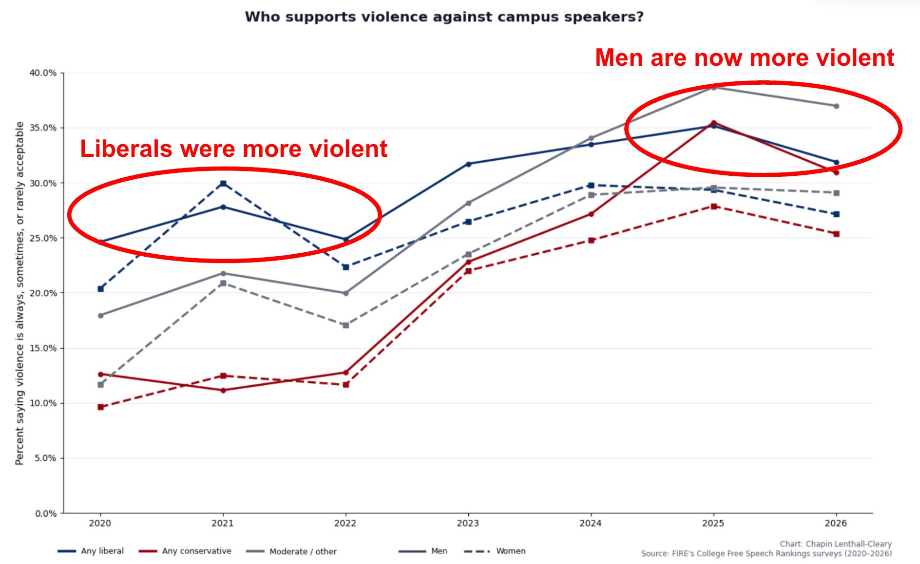
In 2021, liberal college students were much more accepting of violence against speakers than their conservative counterparts.
Acceptance of using violence to stop campus speech has risen sharply among conservatives and moderates since 2022, especially among men, to the point that college men are now more accepting of using violence than women, regardless of ideology.
This isn’t because men are more censorious. Men are, if anything, more willing to allow speakers on the other side than women are to hear speakers on their own side.
Opposition to using violence to stop speakers isn’t the same as tolerance. Plenty of students who oppose violence against speakers also oppose their rights to speak in the first place.
That said, perfectly tolerant students — those who would definitely allow every speaker we asked about — and perfectly tolerant men in particular, have unusually low acceptance of using violence against speakers. As far as our data on these questions can measure, there is a genuinely principled pro-free-speech faction out there, and it makes up roughly one in 20 men and one in 79 women.
Long version
There’s a common trope that liberals, especially liberal college students, often support using violence or shoutdowns to stop people they disagree with from speaking. It’s no secret that there are plenty of examples of this behavior. But are those isolated incidents, or do they reflect a broader pattern? Are liberal students more violent?
I’ll use “violent” as a shorthand for acceptance of using violence against speakers. I’m not necessarily talking about willingness to personally commit violence — actual instances of students saying they’re personally willing to use such violence are rare.
We saw before that student support for violence against speakers has nearly doubled since 2020. Let’s rebuild that plot, binning by both ideology and gender:
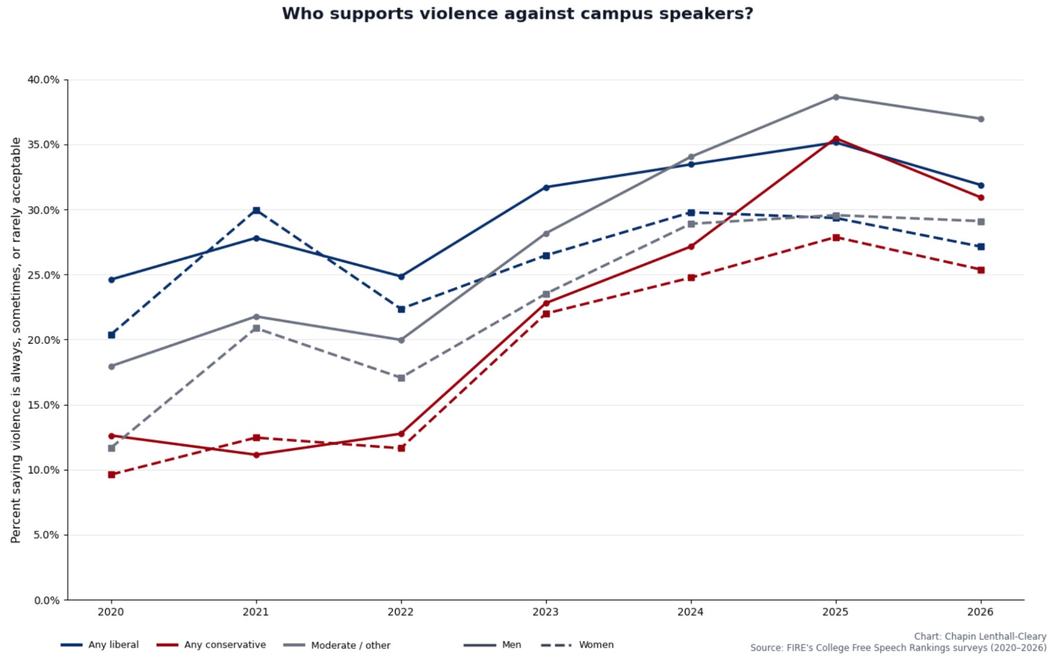
From 2020-2022, liberals were much more likely to accept the use of violence against speakers. But from 2022-2025, conservatives’ and moderates’ acceptance of using violence shot up, especially among men. These increases closed the violence gap between liberals and everyone else, even as the gap between men and women simultaneously greatly widened. Now, the least violent male ideology group is more violent than the most violent female ideology group.
One thing to keep in mind is that these ideology groups are broad. When we ask students to identify their politics, we give them 11 options, which I sorted into liberal, conservative, and moderate for the plot above. A student labeled “liberal,” for example, could be slightly liberal, somewhat liberal, or very liberal. It’s possible that lumping these groups together produces strange effects or obscures important dynamics. So let’s separate them. It’ll be visually messier, but more telling:
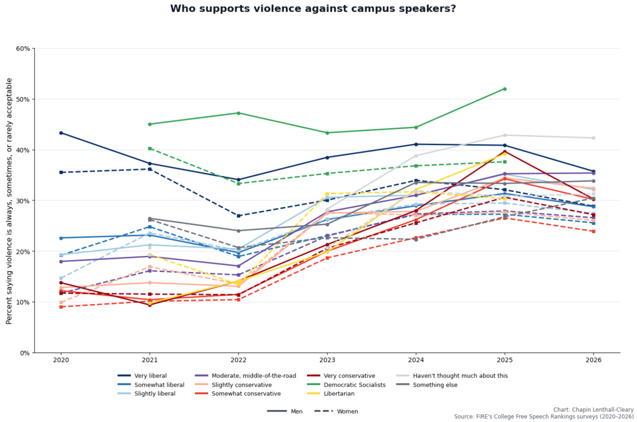
The pattern remains.
There used to be a massive gulf in support for violence between “very liberal” students (and democratic socialists, a separate ideology option in our survey) and everyone else, especially conservatives. That gap is gone, replaced by a gender gap, such that every male ideology is now more violent than its female counterpart.
A couple of secondary details are worth flagging. In 2021 and 2022, support for violence tracked the political spectrum fairly neatly — the more to the left you went, the more support for violence you saw. By 2025, violence on the far right had increased such that the extremes on both sides were among the worst offenders. But in 2026, violence at the extremes has subsided a bit, while increasing among moderates. The result is that political ideology is no longer a predictor of support for violence.
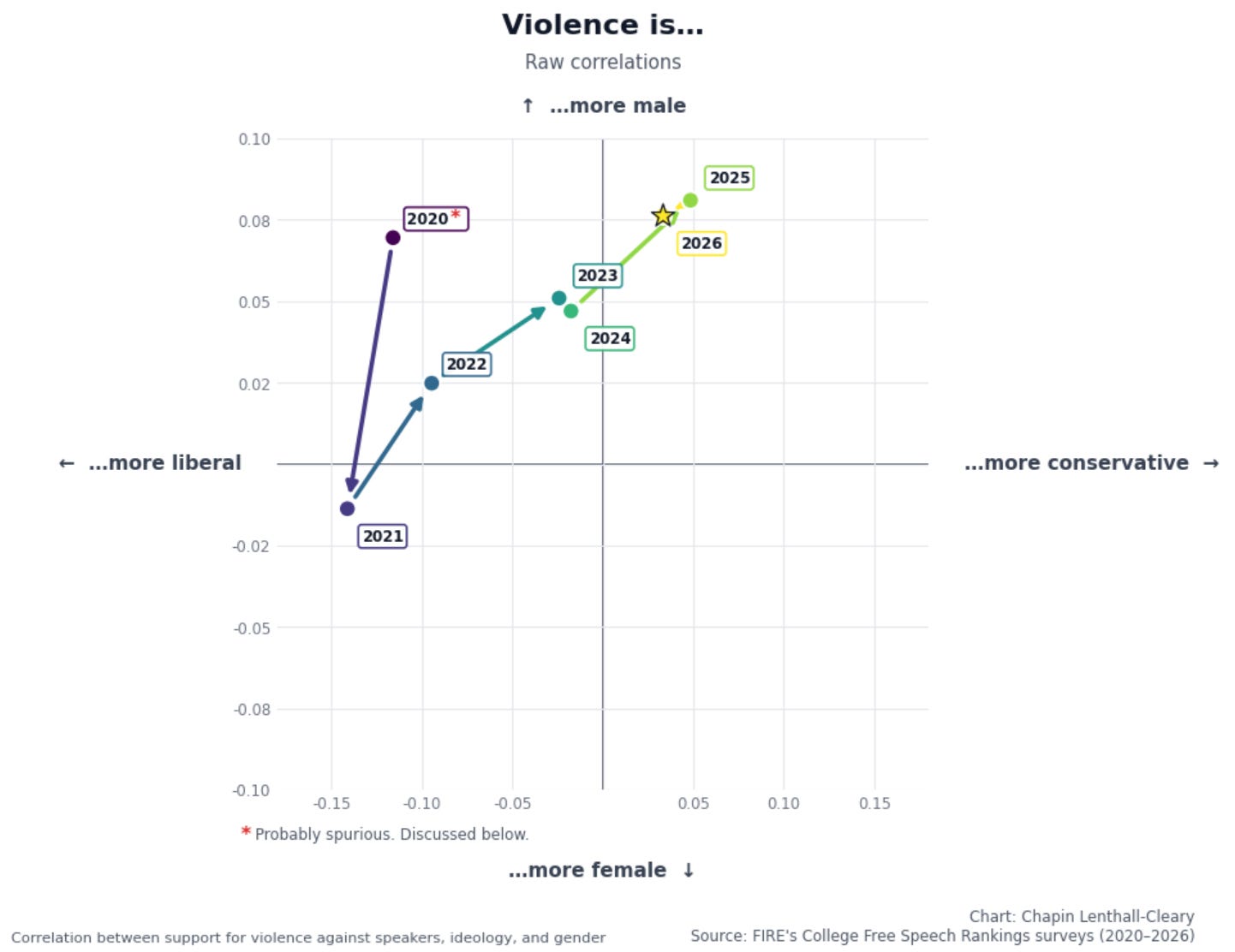
Okay, we’ve been eyeballing the relationship between ideology, gender, and violence, plus how it changes over time. Let’s measure that relationship directly by making a scatterplot of the correlation between violence and gender and ideology. That is, how male-or-female and how liberal-or-conservative violence was each year. This isn’t going to show how many people in each group support violence, but how strongly group membership predicts violence:
Well, that’s a trend.
In 2021, liberals were substantially more violent than conservatives, and women were slightly more violent than men. By 2025, conservatives had become slightly more violent than liberals and men were now substantially more violent than women. In other words, violence is now a gendered issue — the main gap in the numbers is between men and women, not liberals and conservatives. And, other than the break in 2024, the trend between 2021 and 2025 is fairly clean.1
Okay, what’s going on with 2020? Is it spurious, or did the trend actually take that sharp turn? Anything strange about 2020? (I know, I can’t think of anything either. I mean anything strange about the survey.)

Well, it turns out the violence and ideology questions were worded fairly differently in 2020, the first year we ran the survey. The 2020 violence question asked about stopping “a speech or event,” compared to “a campus speaker” in 2021 and after. That could have affected the results anywhere from not at all to significantly. If significantly, the sharp change in the trend might be totally spurious. Given that uncertainty, and recognizing that the bizarre shift could be real, I’ll exclude 2020 from further analysis (see GitHub for year-by-year question wordings).
Another important note: The graph above calculates raw correlations between gender or ideology and violence, but there’s a fairly strong argument that we don’t actually want to do that. In 2021, for example, women were more violent. But liberals were also more violent, and women are more likely to be liberal. It might be that women were only more violent insofar as they’re more liberal, in which case it’d be questionable to call violence “a female thing.” We can adjust for that with a multivariate regression. That means when we plot the correlation between, say, gender and violence, we’re measuring specifically the gender effect, holding ideology constant, and vice versa:
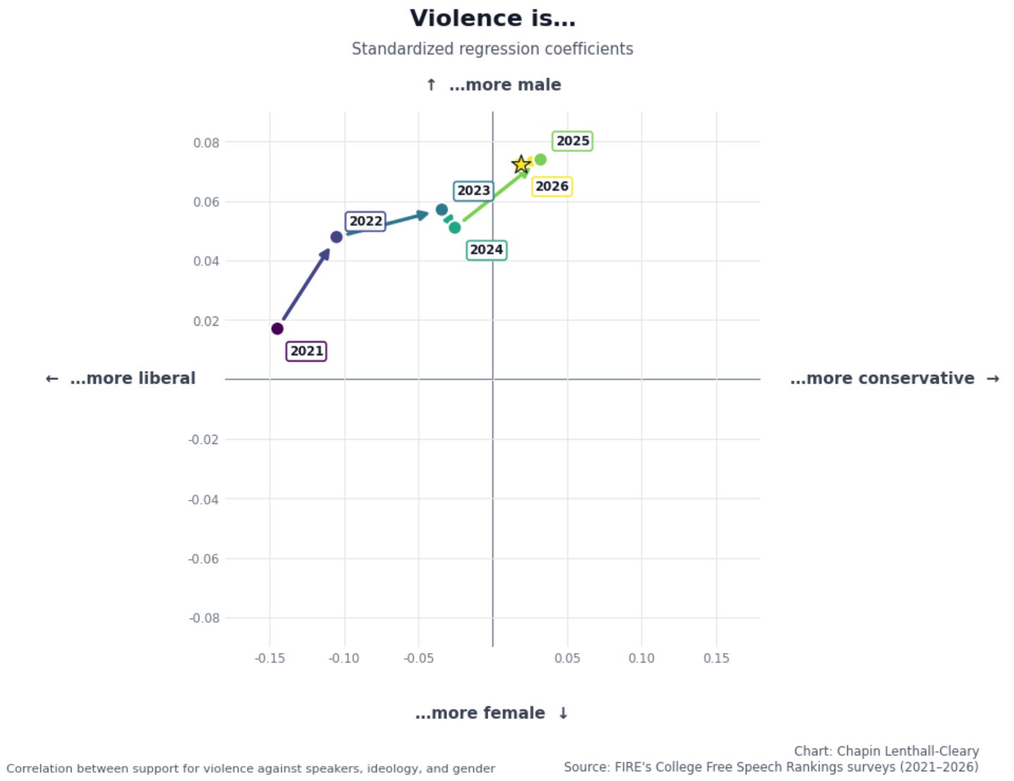
Boom.
From 2021 to 2025, violence went from being a liberal thing to being a male thing, and it stayed a male thing in 2026. In 2021, liberal students were more than twice as violent as conservative students,2 and very liberal students were nearly three times as violent as very conservative students. Now, conservatives are a hair less violent than liberals, but men are 30% more violent than women. Violence is depoliticizing and becoming gendered instead: On this issue, liberals and conservatives agree, and men and women don’t.
Okay, we’ve seen before that women are much more censorious than men — often less tolerant of speakers on their own side than men are of speakers on the other side — so what gives? Men across the political spectrum are much more likely to want to allow speakers to speak, so why are they also more likely to endorse violence against them?
My first guess is that there’s basically a pipeline here. Supporting violence against speakers requires two things: supporting censorship, and being generally willing to endorse aggressive action against things you dislike. As the theory goes, men are less likely to pass the first stage and more likely to pass the second. Men are less censorious, but since they’re more inclined toward aggression, the men who are censorious are more violent in their censoriousness.
How can we test that? If the pipeline theory is true, we’d expect less censorious people to tend to be less violent. More specifically, we’d expect to see a sort of three-out-of-four-boxes-filled effect: violent censorious people, nonviolent censorious people, and nonviolent tolerant people, but not many violent tolerant people. Do we see it? Let’s start by plotting support for violence against tolerance, separately for men and women:
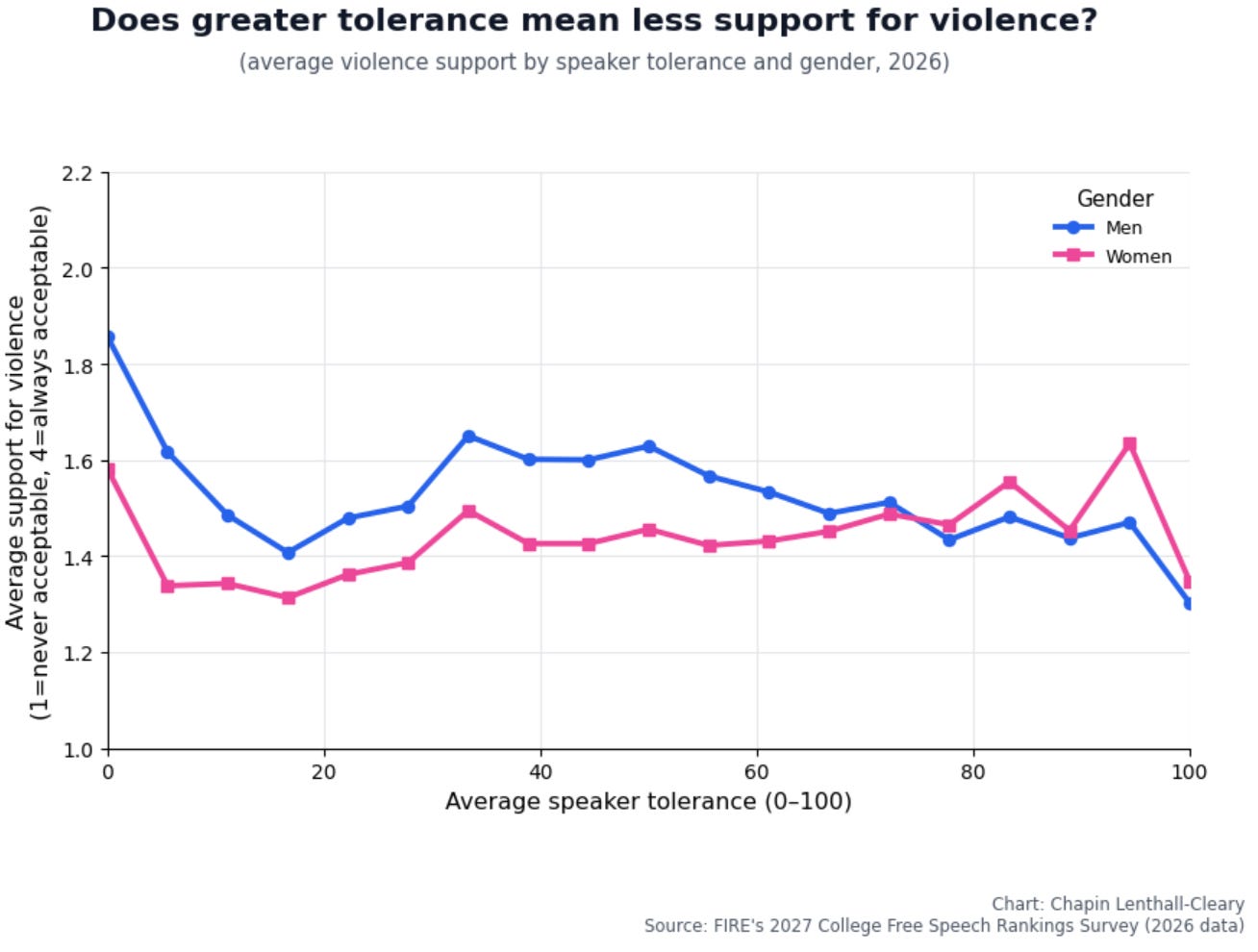
Getting somewhere...
Among men, there’s a very rough trend of higher tolerance correlating with lower support for violence. There are significant deviations, most notably the dip in the ~11% to ~22% range. But the overall trend roughly holds. The perfectly intolerant men are the most violent. The perfectly tolerant men are the least violent. The mostly tolerant men (think 67% and above) have lower support for violence than most of their male peers. That’s all consistent with at least a partial pipeline effect among men: Not all intolerant men are violent, but many of them, and certain groups in particular, are.
Among women, the relationship between intolerance and violence is much weaker. There’s still some effect of perfectly tolerant women being less violent, but it’s constrained to a smaller group than among men (especially given how few perfectly tolerant women there are), and even among that group the effect is weaker than in men. Unlike with men, the pipeline theory doesn’t fit the data for women, except for the modest effect at the very top of the tolerance scale. Indeed, despite men being significantly more violent overall, perfectly tolerant men are less violent than perfectly tolerant women.
Okay, what is going on with that dip between ~11% and ~22%? Well, 22% average tolerance could mean, among other possibilities, that someone has 22% tolerance for both sides, or 44% for one side and zero for the other, or vice versa. So we need a plot that can disambiguate those, which means there’s probably no easy way out here. We’re going to have to make some really thorny plots. Recall this heatmap from before (adjusted to use 2026 data here):
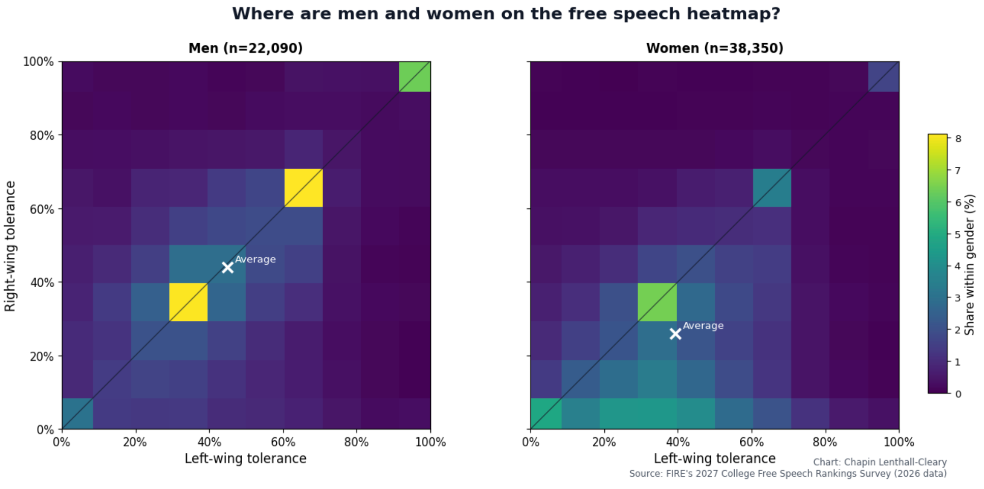
Each square on this heatmap is some combination of left- and right-wing tolerance, and the colors show the frequency of that combination. Brighter means more people with those values. The top-right square, for instance, is 100% tolerance for speakers on both sides, and 6.3% of men and 1.6% of women occupy that square.
To show the relationship between both kinds of tolerance and violence, we’ll make a similar heatmap, but instead of each cell being colored by how many people are in that cell, it’ll be colored by how violent the people there are, with darker meaning more violent:
That’s a doozy.3
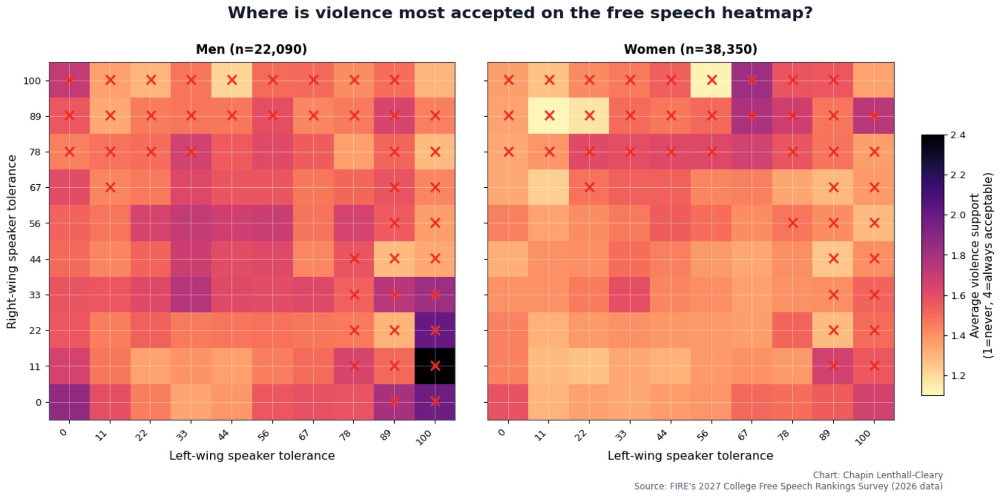
Regarding the strangely low cell on the women’s heatmap at 67% right-wing tolerance and 11% left-wing tolerance: I’m inclined to regard that cell as spuriously nonviolent due to having n=108, being surrounded by higher-violence cells, and not seeing a dip there in the men’s heatmap.
I’ve put red Xs on cells with fewer than 100 students. Those cells will be noisier, so treat them as suspect.
Okay, what’s notable here? There are two regions of especially low violence: the middle-left of the bottom two rows, and the top-right square. For clarity, here are the same plots with those regions boxed in green:
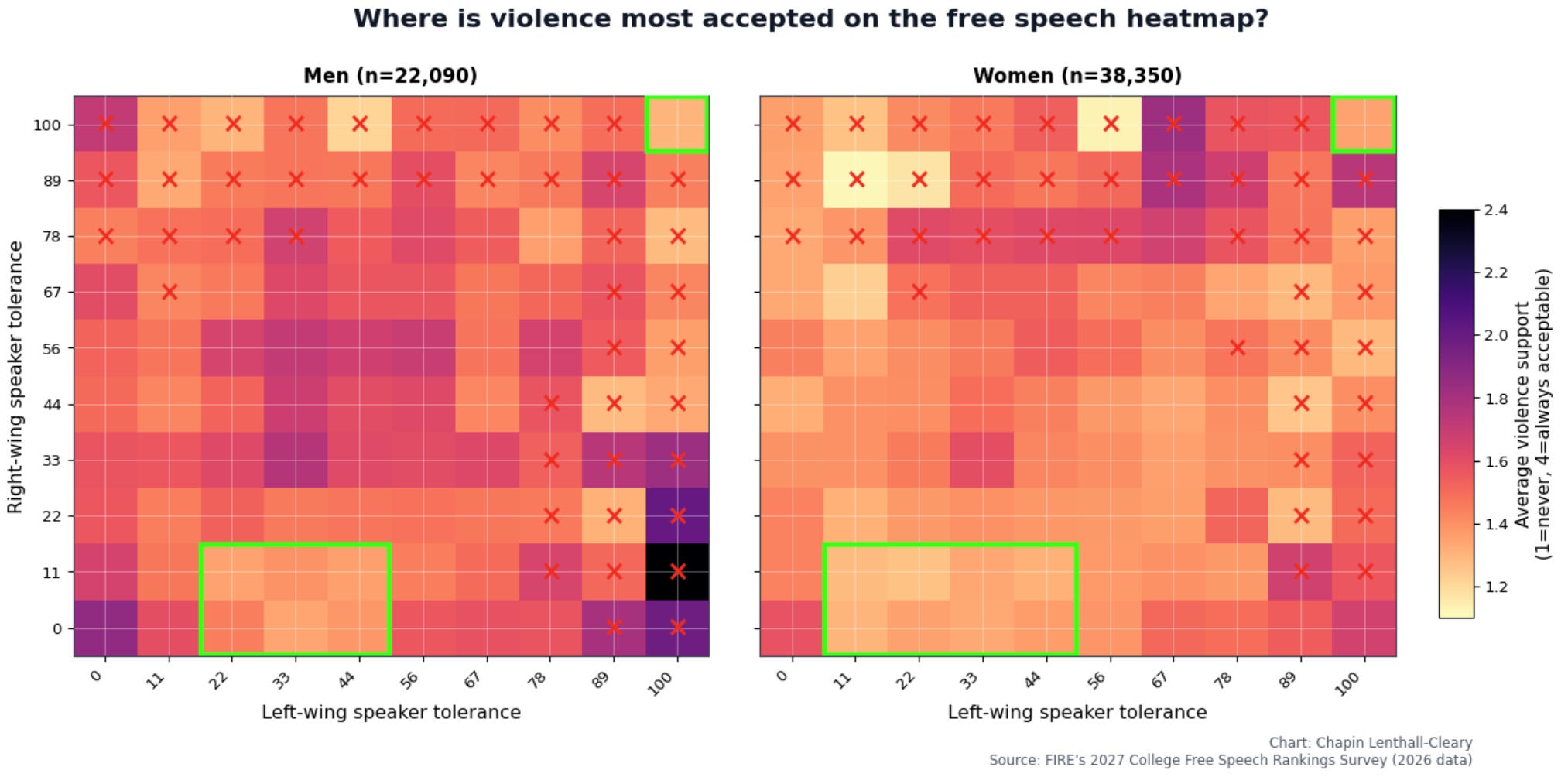
The top-right square is simple enough: Students who demonstrate perfect tolerance for speakers on both sides are also extremely opposed to violence against speakers. This holds true for men and women, but it’s more pronounced among men. Indeed, almost no group, male or female, is more opposed to violence against speakers than perfectly tolerant men. These students — who are willing to allow every speaker we asked about, and who said violence against speakers is never acceptable — make up roughly 5% of men and 1.3% of women.
The other region of low violence has middling left-wing tolerance and zero or near-zero right-wing tolerance, with slightly different boundaries for men and women. I see two possibilities for what motivates the people here. The first is a “keep the status quo and avoid disruption” attitude: I’m tired of hearing about this nonsense. Make it go away. The second possibility is a desire to avoid perceived harm, whether the physical harm of violence or the emotional “harm” of offense: This could hurt vulnerable people.
So what about the regions of high violence? There’s a dark clump in the center of the graph corresponding to middling tolerance for speakers of both sides, with a slight rightward tilt. I’d guess these people tend to be especially apathetic and politically uninvolved. How can we check that? Well, we ask students about their voter registration. Are the violent students in the middle of the heatmap less likely to be registered to vote? (Notably, students who are unregistered to vote are more violent.) Let’s check with a similar heatmap showing the share of people in each cell who are registered. Lighter regions have higher voter registration, darker ones lower:
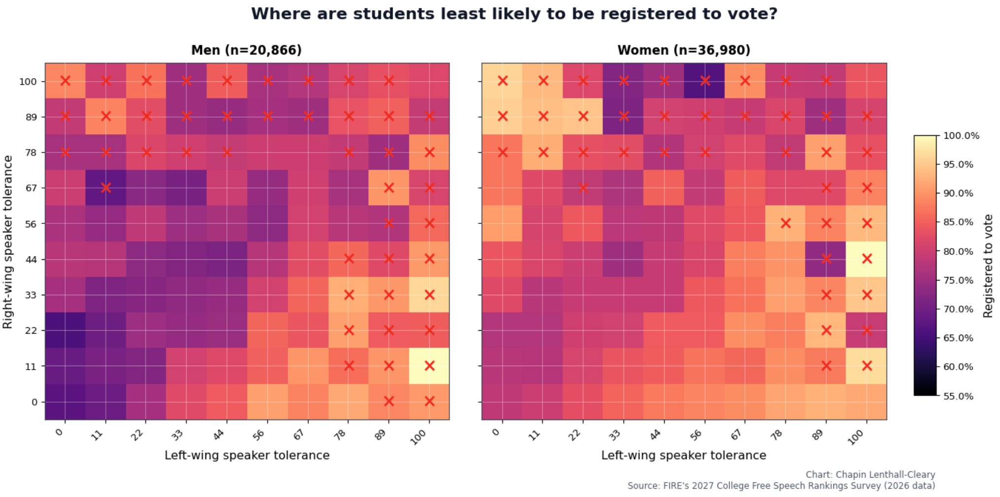
See the resemblance?
In both heatmaps, the middle region is roughly tied with the bottom-left (low tolerance for both sides) for the lowest registration rates. Looks like apathy to me.
That suspicion — that the people in the middle of the heatmap are a case of apathy-driven support for violence — is further corroborated by students who respond haven’t thought much about this to the ideology question disproportionately being in that region, and by those students having unusually high support for violence (see the line graph binned by ideology earlier in the article).
Returning to the question of violence: At least among men, there’s also unusually high violence in the bottom-left corner, which corresponds to perfect intolerance. Here’s the same violence heatmap with that square boxed:
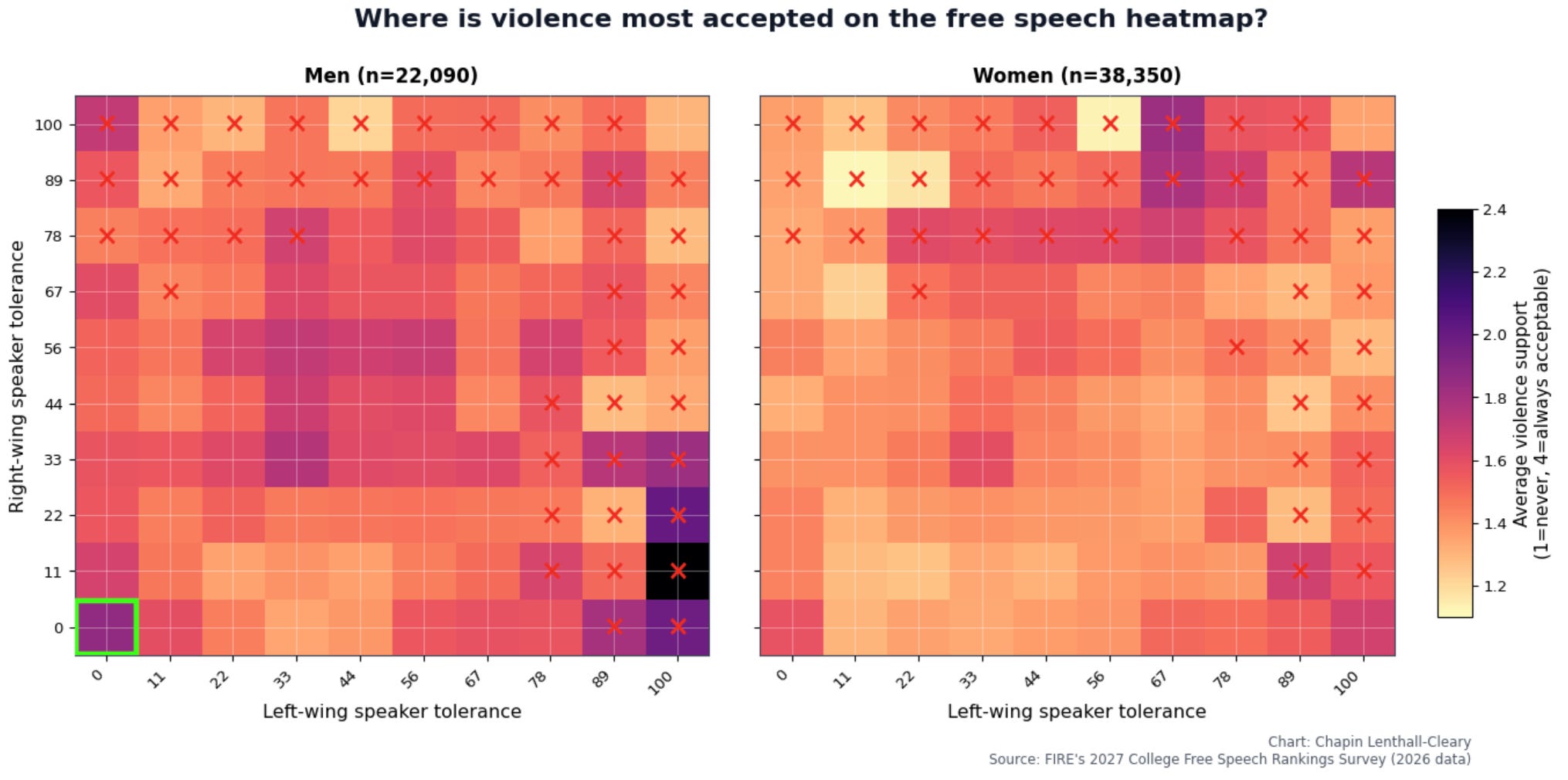
Amusingly, this almost looks like there’s a (principled?) anti-speaker faction among men. A full 11%4 of perfectly intolerant men say violence against speakers is always acceptable, compared to just 4% of perfectly intolerant women: Fuck those grifters. They deserve everything they get.
Notably, when comparing corresponding cells across the male and female heatmaps, the male cells usually show higher violence, with some important exceptions like perfect tolerance. Presumably, that reflects men being generally more aggressive. But that higher aggression may cut both ways. Assuming it’s at least partly responsible for the general shape of the male distribution, it may be driving men to hold whatever position they already hold more aggressively, leaving perfectly tolerant men almost uniquely opposed to violence against speakers.
There are some remaining puzzles here. The violence heatmaps for 2021 and 2022, for example, look bizarrely different from those in later years. I’d speculate that being pushed towards violence by your ideology, or specifically as a means to stop speech you see as harmful, can happen to women at least as much as men, whereas reacting to bad situations or being fed up with the state of the world with a general turn toward violence is more of a male thing.

But the overall picture is clear. The trope of liberal college students being uniquely violent against speakers described a widespread reality, and that reality is already history. The recent rise in support for violence has been spearheaded by men, who are now, regardless of ideology, more violent than women. This isn’t because men are disproportionately anti-speech or anti-speaker. On the contrary, women are seemingly more likely to belong to a status quo or harm-avoidance faction opposed to both violence and allowing speakers to speak. And men, seemingly driven by higher aggression, are to varying degrees more supportive of violence than women, almost regardless of their attitudes toward speakers.
Almost regardless. Perfectly tolerant women have fairly low support for violence, but basically no group is more opposed to violence against speakers than perfectly tolerant men. This is a dismaying gender difference, but it’s also one with a glimmer of hope in it. As far as our data on these questions can measure, there is a genuinely principled pro-free-speech faction out there, comprising roughly one in 20 men and one in 79 women. If we can better understand what makes these principled men and women unique, we may learn how to replicate it.
The code, data, and codebook used to generate these plots are available here.
Note that the numerical values across different axes aren’t naively comparable. The correlations displayed are Pearson’s r values, which measure the strength of the linear relationship between two variables. It’s possible, for example, to have a perfect relationship between two variables that has a weak r value, especially when data is very discrete. And because gender is a binary variable and ideology is a 7-point scale, Pearson’s r is going to measure them in differently imperfect ways. Other correlation coefficients might stretch/shrink the graph in one dimension. All that said, the general shape of the graph is still trustworthy.
Taking an average score of violence with rarely acceptable=1, sometimes=2, always=3. Also controlling for gender (or ideology for the gender comparisons), though that doesn’t change the results much.
Yes, the dot/inner product of the prevalence and violence heatmaps is the mean male/female support for violence. I.e. if you multiply the values in each corresponding cell of the violence and frequency heatmaps and add those products all up, you get the average support for violence for men/women.
It does seem like, especially among men, an unusually high number of the perfectly intolerant men who say violence is always acceptable aren’t taking the survey seriously, for example by selecting the first option for every question in the survey. Hard to exactly assess, but, after removing those who seem to not be taking the survey seriously, roughly 9% of perfectly intolerant men still say that violence against speakers is always acceptable.

“In 2021, liberals were substantially more violent than conservatives, and women were slightly more violent than men.” I think maybe this could have been worded in such a way that taking it out of context wouldn’t be straight up false. Women are not more violent than men by any general definition.